Getting more customers usually depends less on getting more traffic and more on making it easier for the right visitors to take action. If people land on your site but don’t call, book, message or buy, the issue is often conversion, not visibility. For many UAE businesses, a few practical changes can lift enquiries and sales without a full redesign or a bigger ad budget.
That matters even more in Dubai, Abu Dhabi, Sharjah and across the UAE, where many people browse on mobile, compare options quickly and make fast decisions based on speed, clarity and trust. A slow page, weak call to action or confusing layout can cost you leads, and some reports suggest businesses can lose a large share of potential enquiries when conversion paths are poor. These 15 simple website conversion tips are built to help service businesses, directories and small online shops turn clicks into bookings, calls and sales, and if you want more visibility alongside better conversion, you can also get your UAE business discovered for free. Let’s start with the fixes that make the biggest difference first.
Start with what visitors notice in the first few seconds
The first few seconds decide whether a visitor stays, scrolls, or leaves. Most people do not read your page from top to bottom. They scan, judge fast, and ask one simple question: am I in the right place? If your page answers that clearly, you give yourself a much better chance of getting the call, booking, message, or sale.
This matters even more for UAE businesses because many visits come from mobile search, map results, paid ads, WhatsApp shares, and quick comparisons between several providers. In that moment, clarity beats clever wording. Your page should feel like a clear shopfront, not a maze.
Make your headline explain what you do, who it helps, and why people should choose you
Your headline is often the first real decision point. If it is vague, stylish but unclear, or focused on your brand instead of the visitor, people won’t work hard to decode it. They will simply move on.
A strong value proposition above the fold usually needs just three parts:
- One plain headline that says what you do.
- One short supporting line that adds who it is for or what result they get.
- One main call to action that tells them what to do next.
That is enough to create direction without clutter. In many cases, less wins because it removes friction.
A good headline doesn’t try to sound clever. It helps the visitor feel certain.
The easiest way to write it is to match the wording people already use in search. If someone searched for “family clinic in Abu Dhabi” or “emergency plumber in Dubai Marina”, your page should echo that need in natural language. The closer the match, the faster the visitor feels they have landed on the right result.
Here are simple examples that work better than generic claims:
- Legal services: UAE Employment Lawyers for Employees and Small Businesses
Supporting line: Get clear advice on contracts, disputes, and workplace claims in Dubai and Abu Dhabi.
CTA: Book a Consultation - Clinic: Same-Day GP Appointments in Abu Dhabi
Supporting line: Friendly care for families, professionals, and children, with evening slots available.
CTA: Book Your Visit - Home maintenance: 24/7 Home AC and Plumbing Repairs in Dubai
Supporting line: Fast-response technicians for apartments, villas, and offices across key service areas.
CTA: Get a Quote - Education: IELTS Coaching for Working Professionals in Sharjah
Supporting line: Flexible evening classes, mock tests, and practical support from experienced tutors.
CTA: Request a Callback - Restaurant: Fresh Lebanese Grill in Jumeirah for Family Dining and Delivery
Supporting line: Enjoy charcoal grills, mezze, and quick ordering for lunch, dinner, or gatherings.
CTA: Order Now

Notice what these examples do well. They are specific. They mention the service, the audience, or the place. They also avoid empty phrases like “trusted excellence” or “quality solutions”, which sound polished but say very little.
If you are not sure whether your headline works, use this quick test. Remove your logo, design, and images for a moment. Then read only the headline, the supporting line, and the button. If a new visitor can understand your offer in five seconds, you are on the right track.
If you want to sharpen your page messaging further, UAEThrive’s guide to improving your free listing details is a useful example of how clear service descriptions, locations, and contact options help visitors convert faster.
Keep one main action on each page so visitors do not feel pulled in too many directions
Once the visitor understands your offer, the next job is simple: guide them to one main action. Too many buttons, banners, pop-ups, and offers create the same feeling as a shop assistant shouting five different instructions at once. People pause, hesitate, and then leave.
This is where many pages lose conversions. A business wants visitors to call, fill in a form, read the blog, join WhatsApp, view pricing, follow Instagram, and download a guide, all at the same time. The result is noise.
Each page should have one primary goal based on intent. For example:
- A service page might focus on Get a Quote
- A clinic page might focus on Book an Appointment
- A local emergency page might focus on Call Now
- A sales page might focus on Start Checkout
- A lead generation page might focus on Request a Callback
That main action should stand out most. It should appear near the top, repeat naturally lower on the page, and use consistent wording. If the first button says “Get a Quote”, the next one should not suddenly say “Start Here”, “Contact Us”, and “Learn More”. Consistency reduces mental effort.
Secondary links can still exist, but they should support the main goal. For instance, a legal service page may include links to fees, FAQs, or service areas. Those help a careful buyer feel informed. What they should not do is compete visually with the main action.

A simple rule helps here: if your page had room for just one button above the fold, what would it be? That answer usually reveals the action that matters most.
This is also why many high-converting small business pages in the UAE now favour one direct next step, especially on mobile. A WhatsApp tap, callback request, or booking button often works better than giving every option equal weight. If you want ideas for clearer button wording, see these CTA button tips for more clicks.
Show trust early with reviews, proof, and clear business details
People rarely convert on promise alone. They want proof, and they want it early. If your page asks for a call or booking before showing evidence that you are real, reliable, and local, many visitors will hold back.
Place trust signals close to the top of the page, where they support the headline and CTA. You do not need a long wall of praise. A few well-chosen proof points are often enough.
Useful trust markers include:
- Recent customer reviews or short testimonials
- Star ratings, where relevant
- Client or partner logos
- Before-and-after examples
- Verified phone number and email
- Opening hours
- Service areas and location details
- Response times, such as Replies within 15 minutes
- Clear starting prices or consultation fees, where possible
For UAE visitors, practical detail matters. A page feels more trustworthy when it shows that you serve Dubai Marina, Business Bay, Khalifa City, or Al Nahda, instead of vaguely saying “we serve the UAE”. A local phone number helps. So does a visible WhatsApp option, especially for service businesses. If you have a physical presence in Dubai or Abu Dhabi, say so clearly.

Buyers now check signals quickly. They look for signs that a business is active, reachable, and established. Reviews help because they reduce uncertainty. Client logos help because they suggest experience. Clear opening hours help because they answer a practical question before it is asked. In other words, trust is built from many small details, not one grand claim.
A good top section might include a headline, one strong CTA, and a short row of proof such as:
- 4.8 rating from local customers
- Serving Dubai and Abu Dhabi
- WhatsApp replies during business hours
- Transparent pricing available before booking
That kind of information lowers doubt fast. It also helps the visitor compare you favourably against weaker pages that hide key details.
If your business appears in directories or local platforms, keep those details consistent. Matching names, phone numbers, addresses, and hours across platforms supports credibility. If you have not done that yet, you can add your business to UAEThrive so potential customers can see the same accurate details in one more trusted place.
Make your site easy to use on mobile, quick to load, and simple to scan
A visitor can like your offer and still leave if the page feels awkward to use. That is why conversion is not only about headlines and trust. It is also about friction. If your site loads slowly, feels cramped on a phone, or hides the answer someone wants, you make the next step harder than it needs to be.
For many UAE businesses, this is where easy wins sit. You do not need an expensive rebuild. In most cases, a faster page, clearer mobile layout, and better page structure can lift calls, messages, bookings, and sales.
Speed up your pages because slow websites lose visitors who were ready to act
Speed affects conversion in a very simple way. If your page feels slow, people lose patience before they see your offer. They do not always wait for the button, the form, or the price. They leave. That is especially true on mobile, where people are often comparing several businesses at once.
Recent data keeps pointing in the same direction. When mobile load time stretches past a few seconds, a large share of users drop off. Some studies also show conversion rates falling sharply with every extra second of delay, while faster pages convert far better. In plain terms, speed protects demand you already paid for.

Small businesses do not need perfect scores everywhere. They need key pages that feel fast in real life. Start with the pages closest to conversion, such as your home page, service pages, booking page, top product pages, and contact page. Then fix the basics first:
- Compress large images before uploading them.
- Remove sliders, animations, and bulky sections you do not need.
- Cut back on extra scripts, chat tools, trackers, and pop-ups.
- Use simpler layouts with fewer moving parts.
- Check your pages on real phones, not only desktop previews.
A good test is this: open your site on an everyday mobile connection and try to book, call, or submit a form. If it feels slow to you, it feels worse to a new visitor. For practical benchmarks and supporting data, this summary of page speed and conversion statistics shows how quickly delay can affect action. Even modest improvements can make a real difference, especially if your traffic comes from Google Ads, maps, social clicks, or directory listings.
A slow site does not just look weak, it interrupts buying intent.
For more practical ideas, see our guide to UAE website conversions.
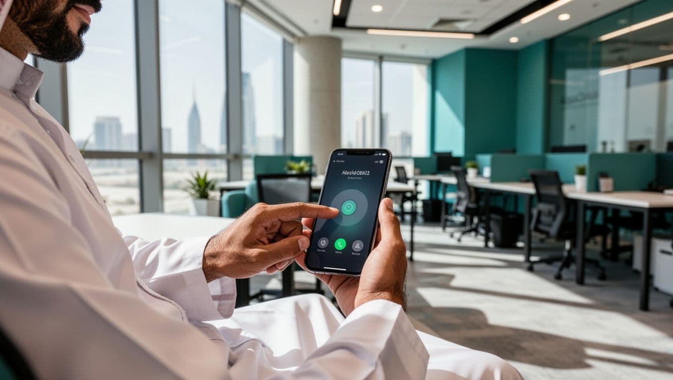
Use mobile-first design with large buttons and easy tap targets
Most visitors now meet your business on a phone before they ever see it on a laptop. So design for the smallest screen first. If the mobile version feels easy, the rest usually follows. If it feels fiddly, cramped, or confusing, you create doubt at the exact moment someone wants to contact you.
Good mobile design is not about trends or fancy effects. It is about making the next action obvious and comfortable. Text should be easy to read without zooming. Paragraphs should stay short. Buttons should be large enough to tap cleanly. Space matters too, because crowded layouts lead to missed taps and frustration.
A strong mobile page usually includes a few basics:
- Readable font sizes, so people do not need to pinch and zoom.
- Short paragraphs, because dense text looks heavier on a small screen.
- Clear spacing around buttons, links, and form fields.
- Simple menus, so visitors do not dig through layers to find what they need.
- Sticky contact options, where suitable, so help is always one tap away.
For local service businesses, click-to-call and WhatsApp buttons often work especially well. Someone looking for a clinic, repair service, legal advice, cleaning company, or restaurant may want a quick answer, not a long form. Meanwhile, ecommerce stores benefit from large add-to-basket buttons, clean product options, and an easy checkout path. Directories and listing sites need filters, map actions, and contact options that are simple to tap, not tiny targets squeezed into a corner.
This is one area where broad advice holds up across sectors. Whether you run a salon in Dubai, a consultancy in Abu Dhabi, or an online shop serving Sharjah and Ajman, mobile ease reduces hesitation. If you want more detail on turning taps into action, these CTA button tips for more clicks pair well with a mobile-first layout.
Write scannable pages that answer key questions fast
People rarely read every line. They scan for proof, price, timing, location, and what to do next. Your page should support that behaviour, not fight it. Think of your content like a helpful receptionist. It should answer the most important questions quickly, then guide the visitor forward.
That starts with structure. Use clear headings that match what real buyers want to know. Keep paragraphs short. Use bullets when they save time. Choose plain wording over branded phrases that sound polished but mean very little. The easier the page is to scan, the easier it is to trust.

A practical service page should answer buying questions such as:
- What does it cost, or what is the usual price range?
- How soon can someone book, order, or get a reply?
- Which areas do you cover?
- Do you deliver, visit on-site, or work remotely?
- What happens after the form is submitted or the call is made?
When those answers are missing, visitors have to work harder. Some will call. Many will not. They will simply return to search and choose a page that feels clearer. That is why scannable content helps conversions and SEO at the same time. Search engines, voice assistants, and AI-generated summaries all favour content that is easy to extract, interpret, and quote back.
A simple format works well here. Add a heading like Service Areas, Pricing, Delivery Times, or What Happens Next. Under each one, answer the question directly in one or two sentences. Then support it with a short bullet list if needed. If you want to tighten weak pages further, a structured review using a website conversion checklist can help you spot missing answers before your visitors do.
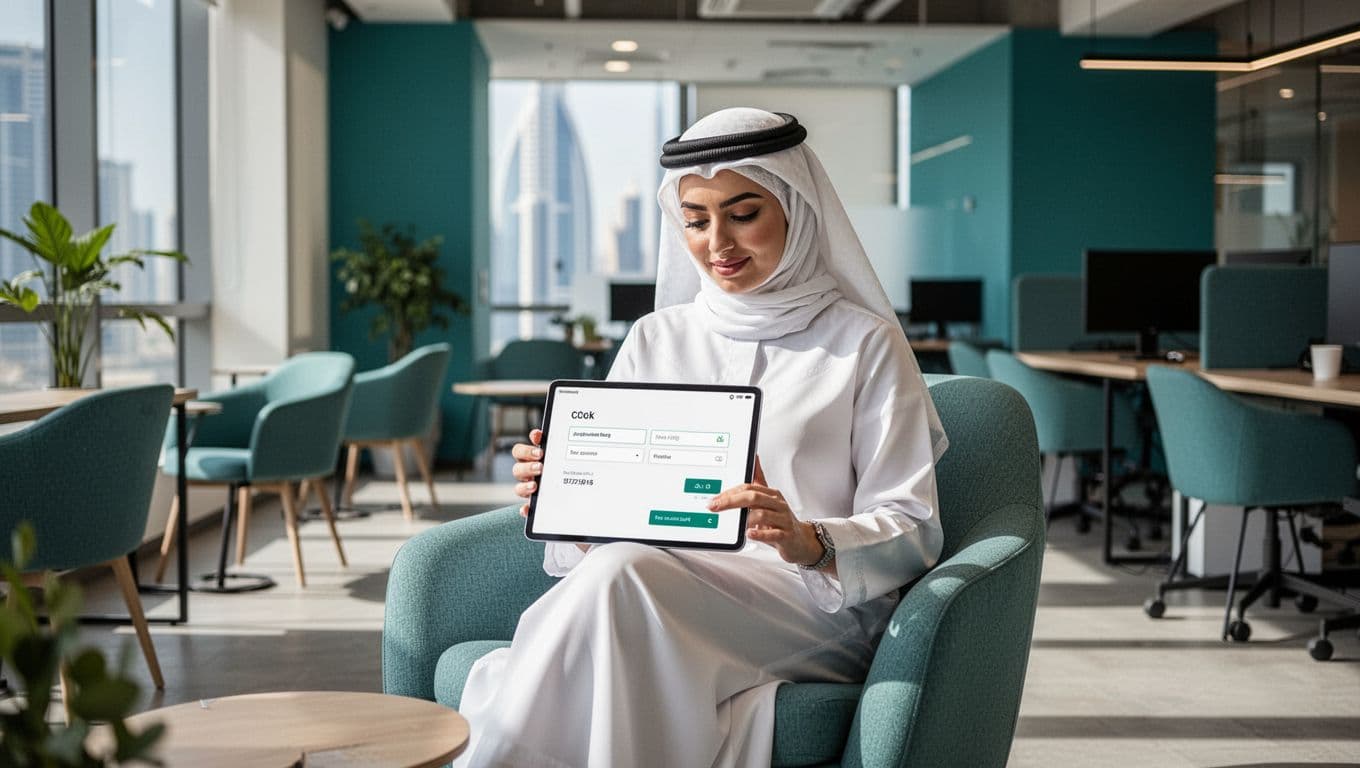
Remove friction from forms, checkout, and contact steps
A visitor can like your offer and still stop short of taking action. Often, the problem is not price or trust alone. It is friction. Every extra field, unclear next step, or surprise fee adds a little resistance, and those small barriers can quietly drain leads and sales.
This matters even more on mobile, where people want to move quickly. If your form feels like paperwork, or your checkout feels uncertain, many will leave and compare another option instead. The fix is usually simple: ask less, explain more, and make the next step feel safe.
Shorten your forms and only ask for what you truly need
Long forms often ask for information that is useful to the business, but not necessary for the first conversion. That is where completion rates start to drop. If someone wants a quote, booking, or quick answer, they should not need to fill in what feels like a loan application.
Start with the basics only. In many cases, that means:
- name
- email or phone number
- one short message or service need
That is often enough for a first enquiry. Later, once the person is engaged, you can collect more detail by phone, WhatsApp, or email. Think of it like opening a door, not conducting a full interview on the doorstep.

A simple first step works well for service businesses across Dubai, Abu Dhabi, and Sharjah. For example, a cleaning company might first ask for the property type and preferred contact method. A clinic might ask only for the patient name, phone number, and desired appointment time. A law firm might start with a short case summary instead of a long intake form.
If you need more detail, use a two-step approach. Let the visitor submit a short form first, then gather the rest later. This keeps momentum going and lowers the feeling of effort.
When you ask for a phone number or email address, add a brief reassurance nearby. A short line such as We only use your details to reply to your enquiry can make a real difference, especially for first-time visitors. People are more willing to share contact details when the purpose is clear and the request feels reasonable.
The best form is usually the shortest one that still helps you respond properly.
Tell people exactly what happens after they click submit
Many forms fail because they create silence. A visitor fills everything in, clicks submit, and then wonders what comes next. Will someone call? Will they get an email? Will they hear back today or next week? That uncertainty causes hesitation before submission and frustration after it.
Set expectations right beside the form or button. A few plain words can remove a lot of doubt. For example:
- We reply within one business day
- A team member will confirm your booking by WhatsApp
- Same-day callbacks are available during business hours
- You will receive your quote by email within 24 hours
These details do two useful jobs at once. First, they make the form feel safer to complete. Secondly, they improve lead quality because visitors know the process before they enquire. That means fewer mismatched expectations and fewer low-intent submissions.
This is especially useful for UAE businesses that rely on fast contact. If your business handles bookings, site visits, or consultations, say so clearly. If your team replies by WhatsApp, mention that. If you only respond during office hours, be open about it. Clear expectations feel professional, and they help avoid the awkward gap between enquiry and response.
A good rule is simple: if a new visitor asked, What happens after I send this?, your page should answer that before they need to ask.
Make buying or booking feel safe by removing surprises at checkout
Checkout friction is often less about design and more about unwanted surprises. If extra charges appear too late, payment options are unclear, or delivery details are vague, shoppers start to second-guess the purchase. Recent industry benchmarks often place cart abandonment above 70 per cent, which shows how sensitive buyers are to friction during checkout.
For ecommerce stores and paid bookings, transparency matters more than clever design. Keep the process clear by showing:
- guest checkout, so people do not have to create an account
- full costs before payment, including delivery or service fees
- accepted payment methods, shown early
- simple delivery, collection, return, or cancellation details
Mobile users feel this most sharply. If the checkout is awkward on a phone, or if key information appears too late, people will leave. By contrast, a straightforward process feels calm and trustworthy. A shopper should know the total cost, delivery window, and payment choices before reaching the final step.
This does not need to be complicated. A clear line such as Free delivery in Dubai on orders above AED 150 or Cancellations allowed up to 24 hours before the appointment can prevent a lot of drop-off. For ecommerce teams that want deeper research on where shoppers abandon, Baymard’s cart abandonment benchmarks are a useful reference point.
Offer helpful next steps for visitors who are interested but not ready to buy yet
Not every visitor is ready to book, buy, or call on the first visit. That does not mean they are a lost lead. In many cases, they simply need a lower-pressure next step.
This is where softer conversion paths help. Instead of pushing every visitor towards the same hard action, give them an option that matches their stage of intent. Depending on your business, that might include:
- saving an item for later
- requesting a callback
- asking a question
- joining your newsletter
- downloading a useful guide or checklist
These smaller actions still matter because they keep the conversation open. A warm lead who joins your list or asks a quick question is far more valuable than an anonymous visitor who disappears.
For example, a property consultant in Abu Dhabi might offer a callback request instead of a full consultation booking. A retail brand in Dubai might let visitors save products to revisit later. A B2B service firm in Sharjah could offer a short checklist or guide before asking for a meeting. The goal is not pressure. It is progress.
If you want a practical example of low-pressure improvement ideas, the UAEThrive optimisation guide for higher conversions shows how clear response promises, stronger CTAs, and better contact choices can lift enquiries without making the page feel heavy. Sometimes the best way to win more customers is simply to give interested visitors an easier next step.
Use stronger calls to action and page content that helps people say yes
A good page does more than describe your service. It nudges the visitor forward with the right words, at the right moment, and answers the doubts that stop action. When your calls to action, page message, and supporting content all line up, people feel less risk and more certainty. That is usually the point where clicks turn into enquiries.
Write calls to action that are clear, specific, and easy to trust
A weak CTA is like a shop assistant mumbling at the till. People hesitate because they are not sure what happens next. Words such as Submit or Learn More often feel vague, especially on service pages where visitors want a clear next step.
By contrast, button text like Get a Free Quote, Book Your Consultation, or Check Availability tells the visitor exactly what they will get. That small shift lowers uncertainty. It also matches how people think when they are ready to act.

Here is the difference in simple terms:
| Vague CTA | Clear CTA |
|---|---|
| Submit | Get a Free Quote |
| Contact Us | Book Your Consultation |
| Learn More | See Treatment Options |
| Start | Check Prices |
| Click Here | Request a Call Back |
The best label depends on intent. If someone wants pricing, say that. If they want a booking, say that. If they need a quick answer, a button like Talk to an Expert or Message on WhatsApp may work better than a generic form prompt.
Clear CTA copy also works best when it appears naturally through the page. Do not rely on one button at the top and hope for the best. On longer pages, place the main CTA:
- after a strong proof point
- below a pricing or process section
- after customer reviews
- under an FAQ block
That way, the button appears when the visitor feels ready, not just when the page designer decided it should appear.
Some recent conversion data points in the same direction. Clear, action-led CTA wording can lift results sharply, and tests often show meaningful gains from changing just a few words. If you want extra ideas for wording and placement, UAEThrive’s guide on CTA button tips for more clicks is a useful follow-on resource. For broader benchmark examples, this summary of CTA button best practices is also worth a look.
Your CTA should answer one silent question: “What do I get if I click this?”
Match each page to one search intent so visitors feel they landed in the right place
Search intent sounds technical, but it is simple. It means why someone searched in the first place. If a person types Dubai accounting services, they do not want a broad page about business growth. They want an accounting service page that speaks to Dubai, explains what is offered, and shows how to get started.
That is why each page should focus on one clear need. When the page matches the search, the visitor feels, “Yes, this is for me.” That feeling drives conversions.
For example:
- Someone searching Dubai accounting services expects local tax, bookkeeping, or audit support, plus a simple way to request a quote.
- A search for Abu Dhabi office fit-out should land on a page with project examples, timelines, sectors served, and a strong consultation CTA.
- A person looking for a Sharjah family clinic wants opening hours, appointment details, location cues, and trusted medical proof points.
If your page stays general, the visitor has to do the mental work. Most will not. They will go back to search and choose a page that speaks more directly.
This matters for local SEO because Google looks for relevance between the query and the page content. It also matters for AI search visibility, where summaries often favour pages that answer a narrow request clearly. If your headings, service details, FAQs, and CTA all point to the same intent, your page becomes easier for search engines, AI tools, and human readers to understand.
A few simple checks help here:
- Put the service, place, and likely outcome near the top.
- Use examples and wording that fit that exact need.
- Keep one main CTA tied to the page goal.
- Remove unrelated offers that distract from the decision.
If you want to tighten this further, the guide on how to improve landing page conversion rate gives practical ways to align message, layout, and next steps. The same rule applies whether you serve Dubai, Abu Dhabi, Sharjah, or other Emirates. One page, one intent, one clear path forward.
Use real examples, FAQs, and comparisons to answer buying doubts before people leave
Many visitors do not leave because they are not interested. They leave because they still have one or two unanswered doubts. That is where page content can do the heavy lifting for you.
Generic claims like trusted experts or high quality service rarely change minds. Real examples do. A short case study, a before-and-after summary, or a plain explanation of how you solved a similar problem gives the visitor something solid to judge.
For instance, an office fit-out firm could say it completed a 3,000-square-foot project in Abu Dhabi within six weeks. A clinic could explain how same-day appointments work for families. An accounting firm might compare monthly bookkeeping support with one-off year-end help. These details make the offer easier to understand and easier to trust.

FAQs matter for the same reason. They answer the questions people often ask just before they act, such as:
- How long does it take?
- What does it cost?
- Which areas do you cover?
- What happens after I enquire?
- Is there a minimum order or booking fee?
A strong FAQ section is not filler. It is a sales tool in plain clothes. It removes friction quietly, without sounding pushy. It also helps with voice search and AI summaries because the questions match how real people search.
Comparisons help as well, especially when buyers are weighing options. You might compare:
- one-off service versus monthly support
- standard package versus premium package
- in-clinic visit versus home visit
- free listing versus paid visibility options
When you explain those choices clearly, visitors do not have to guess. If your business profile itself needs stronger proof points, FAQs, and contact paths, UAEThrive’s guide on how listings work shows how those details help turn views into leads.
A practical addition for the final article is a short Key Takeaways box near this section or later in the post. Many readers skim before they commit. A compact summary of the main lessons can help them absorb the essentials fast and return to the right section when they are ready to act.
In short, buyers say yes more often when your page answers the doubts they would otherwise carry back to Google.
Track what people do, then improve the pages that matter most
Good conversion work starts with evidence, not opinion. Before you change layouts, colours, or copy across the whole site, look at how people already use your pages. That shows you where money is being made, where leads are slipping away, and where a small fix could lift results faster than a full redesign.
Start with your busiest and most valuable pages before changing everything
Not every page deserves the same attention. Your blog archive, privacy page, and old news posts might get visits, but they rarely drive action. Start instead with the pages that attract traffic and sit close to a conversion.
That usually means your:
- home page
- top landing pages
- most-visited service pages
- product pages
- contact page
- booking page
- checkout page

Think of it like fixing the busiest entrance to a shop first. If most people walk through one door, that’s where you clear the clutter.
A few signs will tell you which pages need help most. Look for high traffic paired with weak action. For example, a service page may bring in strong search traffic from Dubai or Abu Dhabi, but very few visitors click the enquiry button. A contact page might get plenty of visits, yet hardly anyone finishes the form. That’s where the opportunity sits.
Focus on simple indicators such as:
- Bounce rate, because a high exit rate can point to weak message match
- Form completion, because long or unclear forms often stop leads
- Button clicks, because they show whether people notice your main CTA
- Calls and WhatsApp taps, because these often matter more than page views
- Booking starts or checkout starts, because these reveal buyer intent
If you’re not sure where to begin, use your analytics platform to rank pages by visits, then compare that with conversions. The best page to improve is often not the busiest one. It’s the page where a modest lift would bring the biggest return. That’s also where a simple conversion ROI calculator can help you judge which fixes are worth doing first.
Don’t redesign the whole house when one sticky front door is causing most of the trouble.
For small businesses, this approach saves time and budget. It also keeps your team focused on pages that support calls, quotes, bookings, and sales right now.
Test one small change at a time and measure what improves
Once you’ve picked a key page, resist the urge to change five things at once. If you rewrite the headline, move the reviews, shorten the form, and swap the button copy in one go, you won’t know what actually helped. A better approach is simple, change one thing, then watch what happens.
That doesn’t need to sound technical. You’re just comparing one version against another and seeing which one helps more people take the next step.

Good first tests are usually small and practical. For example, you might:
- change a vague headline to one that names the service and location
- shorten a contact form from six fields to three
- move customer reviews higher on the page
- swap a button label from Submit to Get a Quote
- simplify a crowded contact section with one clear next step
These tweaks may look minor, yet small gains often add up. Some published test round-ups show that many experiments produce modest lifts rather than dramatic jumps, which is a useful reminder to stay patient. The wins come from steady improvement, not lucky guesses. For a broader snapshot, this collection of A/B testing case studies shows how changes to headlines, forms, and layout can affect results.
You don’t need expensive software to learn from this. Basic analytics can show page views and conversion events. Heatmaps can reveal where people click or ignore. Session recordings can show where visitors hesitate, scroll too fast, or give up. Together, they turn guesswork into a clearer picture.
Keep your mindset simple. Make one sensible change, give it enough traffic, then keep what works. If nothing improves, you’ve still learned something useful. That’s how conversion gains usually happen, one tested step at a time, not through hunches alone.
Common conversion mistakes that quietly cost you leads
Not every conversion problem looks dramatic. In many cases, leads slip away because the page feels slightly confusing, slightly slow, or slightly harder to use than it should. Those small issues stack up, and over time they can cost far more than one obvious design flaw.
The good news is that most of these mistakes are fixable without rebuilding your whole site. Start by looking at your pages through the eyes of a first-time visitor. If the offer, trust signals, and next step are not clear straight away, your site is asking people to work too hard.
Too much clutter, weak messaging, and hidden contact details
A cluttered page doesn’t just look busy, it weakens decision-making. When a visitor sees sliders, pop-ups, multiple offers, vague claims, and too many buttons at once, the page stops feeling like a guide and starts feeling like noise. Instead of moving forward, people pause, scroll without purpose, or leave.

Weak messaging makes that worse. Phrases such as quality service, trusted experts, or solutions for your needs sound polished, but they tell the visitor very little. A strong page should quickly answer three simple points: what you do, who it’s for, and what the person should do next. If that isn’t clear, the visitor has to guess, and most won’t bother.
Hidden contact details are another quiet lead killer. Some businesses tuck the phone number into the footer, hide WhatsApp behind a menu, or make the contact page the only route to get help. That’s risky. If someone is ready to ask a question, book, or request a quote, the path should feel obvious.
A quick review often reveals the same problems:
- Too many offers competing on one page
- Headlines that sound nice but say nothing concrete
- Menus with too many choices
- Contact details hidden or hard to tap
- No reviews, ratings, service areas, or other trust cues near the top
Think of your page like a shopfront on a busy road. If the sign is unclear and the door is hard to find, people keep walking. Your website works the same way.
If a new visitor can’t understand your offer and next step within five seconds, the page needs simplifying.
A practical fix is to strip each key page back to one main job. For a service page, that may be Get a Quote. For a clinic, it may be Book an Appointment. For a restaurant, it may be Call Now or View Menu. Then support that action with a clear headline, one short explanation, and visible proof that you’re real and reachable.
Trust matters here as well. A simple row of proof can do more than a long sales paragraph. For example, showing your location, opening hours, review rating, and response time often helps more than another block of marketing copy. If you serve Dubai Marina, Al Nahda, Khalifa City, or Ajman, say so plainly. Local detail reduces doubt.
Before changing anything major, do one simple test. Open the page, count to five, and ask:
- Is the service clear?
- Is the location or audience clear?
- Is the next step obvious?
If any answer is no, that page is probably losing leads quietly.
Ignoring local buying habits and mobile behaviour in the UAE
In the UAE, many buying decisions happen on a phone, often quickly, and often while comparing several businesses at once. That means a desktop-first website can lose leads even if it looks good on a large screen. Tiny buttons, awkward forms, slow-loading pages, and hidden menus are common problems, and they hit hardest when someone is ready to act now.

This matters across sectors. A parent in Sharjah booking a clinic, a tenant in Dubai looking for AC repair, or a founder in Abu Dhabi searching for legal help usually wants a fast answer. They don’t want to pinch and zoom, fill out six fields, or hunt for a phone number buried at the bottom of the page.
Mobile behaviour in the UAE tends to reward speed and convenience. People often prefer a direct call, a WhatsApp message, or a short callback form over a long enquiry process. So if your site still treats mobile users like an afterthought, you’re creating friction where intent is highest.
The most common local mistakes include:
- Designing for desktop first, then squeezing the layout onto mobile
- Using long forms that feel like admin work
- Making tap targets too small
- Forgetting click-to-call or WhatsApp options
- Writing generic copy with no local relevance
- Failing to mention service areas across Dubai, Abu Dhabi, Sharjah, Ajman, or other Emirates
Local relevance is easy to overlook, but it plays a big part in conversion. A vague line like serving customers across the UAE is weaker than saying you cover Business Bay, Jumeirah, Khalifa City, Al Reem Island, Al Majaz, or Ras Al Khaimah. People trust what feels close, familiar, and specific.
The same goes for expectations. Buyers in the UAE often look for practical detail before they commit. They want to know if you offer same-day service, whether you reply on WhatsApp, what areas you cover, and how quickly someone will get back to them. If those answers are missing, the page feels incomplete.
A useful mobile check is to try your own site with one hand on your phone. Can you call, message, or book in under a minute? Can you read the text without zooming? Can you submit a form without feeling irritated? If not, your visitors probably feel the same.
Keep the fix simple. Put the main contact action where people can see it. Shorten the form. Mention real service areas. Make buttons easy to tap. Cut anything that slows the page down. In other words, build for how people actually buy, not how we wish they would.
Conclusion
Better conversion usually comes from making the path clearer, easier, and faster. That was the thread running through all 15 tips. First, clarity helps people see they are in the right place. Then trust gives them confidence to act. After that, ease removes the friction that slows forms, mobile use, checkout, and contact steps.
Just as importantly, pages convert better when they match intent and guide visitors towards one obvious next step. A strong headline, visible proof, simple layout, direct CTA, and useful FAQs often do more than extra features, more buttons, or more design noise. In other words, the best gains usually come from focus, not clutter.
Testing matters too. Small changes on high-value pages can lift calls, bookings, and sales without a full rebuild. For UAE businesses in Dubai, Abu Dhabi, Sharjah, and beyond, that means a better website is often less about doing more and more about removing what gets in the way.
If you want to strengthen your online presence as well as your conversion path, Get Your UAE Business Discovered for Free with UAEThrive and make it easier for local customers to find and trust your business.